My first ggplot map
Introduction
ggplot is a useful way to create maps and add layers to the map.
In this example we will create a map, highlight the PNA Member EEZs and then overlay the regions of the South Pacific albacore assessment.
Step1
Load all the requited packages.
library(survival)
library(maps)
library(maptools)
library(mapdata)
library(ggplot2)
library(plyr)
library(grid)
library(scatterpie)
Step 2
Load all the mapping data you will need eg. the EEZs you want and the data to be plotted.
all_states <- map_data("world2Hires") # if you want to go above 180 use world2Hires else worldHires

#eez overlay
eez        <- read.table("EZNEW2.txt", sep=" ", header=F, skip=0) #All regions
eez_pna  <- read.csv("pna_eez.csv") #PNA regions

point_data<-read.csv("point_dat.csv") # the data for the points
Step 3
Define the colours for the background and then load all the states (countries) you want to appear in the plot.
#different made up colours for the sea
grecol    <- rgb(red=0,green=100, blue=0, alpha=40, maxColorValue=255) #green colour
blucol    <- rgb(red=60,green=200, blue=175, alpha=70, maxColorValue=255)

#sort(unique(all_states$region)) # to list the states you will need this if you want to add countries to your map

# All states for the map.
states     <- subset(all_states, region %in%
                       c("American Samoa", "Australia", "Canada","China","Cook Islands","Fiji", "French Polynesia",
                         "Guam", "Hawaii", "Indonesia","Japan","Kiribati", "Marshall Islands", "Mexico", "Micronesia",
                         "Nauru", "New Caledonia", "New Zealand", "South Korea","North Korea" , "Niue",
                         "Northern Mariana Islands","Palau",
                         "Papua New Guinea", "Philippines", "Samoa", "Solomon Islands","Tokelau", "Tonga", "Tuvalu",
                         "USA", "USSR", "Vanuatu","Panama","Mongolia" , "Chile","Argentina", "New Caledonia","Belize",
                         "Nicaragua","Ecuador","Honduras","Costa Rica","Colombia", "Uruguay", "Brazil",
                         "Peru", "Guatemala","Venezuela","Bolivia","Paraguay" ))
Step 4
Load the co-ordinates for the regional boundaries and make the labels.
# add the region co-ordinates for the SP albacore assessment
b.x_1 <- c(140,140,170,170,140)
b.y_1 <- c(-10,  0,  0,-10,-10)
b.x_2<- c(140,140,170,170,140)
b.y_2<- c(-25,-10,-10,-25,-25)
b.x_3<- c(140,140,170,170,140)
b.y_3<- c(-50,-25,-25,-50,-50)
b.x_4<- c(170,170,210,210,170)
b.y_4<- c(-10,  0,  0,-10, -10)
b.x_5<- c(170,170,210,210,170)
b.y_5<- c(-25,-10,-10,-25,-25)
b.x_6<- c(170,170,210,210,170)
b.y_6<- c(-50,-25,-25,-50,-50)
b.x_7<- c(210,210,230,230,210)
b.y_7<- c(-25, -5, -5,-25,-25)
b.x_8<- c(210,210,230,230,210)
b.y_8<- c(-50,-25,-25,-50,-50)

# region labels
reg_lab<-c("1","2","3","4","5","6","7","8") # labels
reg_labx<-c(155,155,155,190,190,190,220,220) # x axis co-ordinates
reg_laby<-c( -5,-18,-35, -5,-18,-35,-15,-35) # y axis co-ordinates
Step 5
Now you are ready to start plotting.
# make the map this is compiled like a ggplot graph but it puts it together as a series of layers
my_map          <- ggplot() +
  # add in the polygons (the shape of the eezs)
  # note aes is the long (x) and lat (y) coordinates
  # note add the eezs first then the countries over them
  geom_polygon(data=eez, aes(eez[,1], eez[,2]), colour="white", fill=grecol) + # All eezs
  geom_polygon(data=eez_pna, aes(eez_pna[,1], eez_pna[,2]), colour="white", fill="blue") + # PNA eezs
  geom_polygon(data=states, aes(x=long, y=lat, group = group),colour ="white",  fill="grey10" ) + # Add the countries

  # Add in the region boundaries
  geom_polygon(aes(x=b.x_1, y=b.y_1), color="grey60", size=1.5, fill=NA) +
  geom_polygon(aes(x=b.x_2, y=b.y_2), color="grey60", size=1.5, fill=NA) +
  geom_polygon(aes(x=b.x_3, y=b.y_3), color="grey60", size=1.5, fill=NA) +
  geom_polygon(aes(x=b.x_4, y=b.y_4), color="grey60", size=1.5, fill=NA) +
  geom_polygon(aes(x=b.x_5, y=b.y_5), color="grey60", size=1.5, fill=NA) +
  geom_polygon(aes(x=b.x_6, y=b.y_6), color="grey60", size=1.5, fill=NA) +
  geom_polygon(aes(x=b.x_7, y=b.y_7), color="grey60", size=1.5, fill=NA) +
  geom_polygon(aes(x=b.x_8, y=b.y_8), color="grey60", size=1.5, fill=NA) +

   # Add points (proportion from own region)
  geom_point(aes(x = point_data$lat, y = point_data$long), color="red", size=point_data$val, alpha=0.5)+

  # region labels
  annotate("text", label = reg_lab, x = reg_labx, y = reg_laby, size = 6, colour = "blue")+ # add in the text you want

  coord_cartesian(xlim =c(130,235),ylim=c(-55,40)) + #sets data limits on x and y
  theme(panel.background = element_rect(fill=blucol),
        plot.title = element_text(size = 20),
        axis.text.x = element_text(vjust =1, size = 14, colour = "black"),
        axis.text.y = element_text(hjust =1, size = 14,  colour = "black"),
        axis.title.x = element_text(size=14),
        axis.title.y = element_text(size=14,angle=90)) +
  xlab('long') + ylab('lat')

#p
windows(20,16)
my_map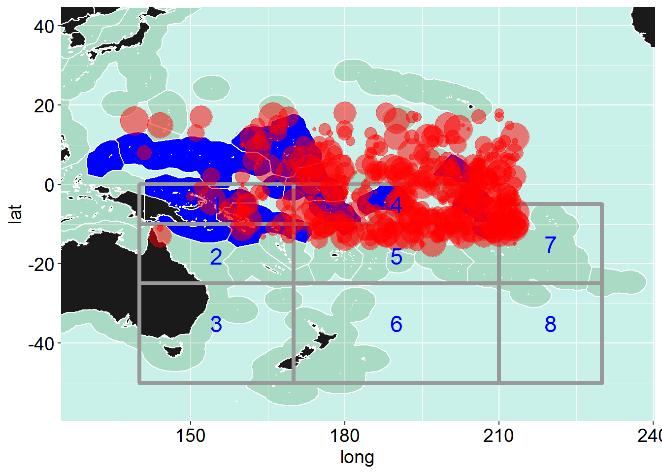
#savePlot("test_map", type="png")Next we will plot some pie charts on a map
As an example we will show the level of catch and the catch proportions averaged over the last 10 years for some PNA mambers longline fisheries
library(survival)
library(maps)
library(maptools)
library(mapdata)
library(ggplot2)
library(plyr)
library(grid)
library(scatterpie)

all_states <- map_data("world2Hires") # if you want to go above 180 use world2Hires else worldHires

# To get the center of a country for plotting
centres <- ddply(all_states,.(region),summarize,long=mean(long),lat=mean(lat))
head(centres)
## region long lat
## 1 Afghanistan 67.425235 34.60546
## 2 Albania 19.968470 41.09875
## 3 Algeria 128.222576 30.47505
## 4 American Samoa 189.769659 -14.27013
## 5 Andaman Islands 92.823019 12.50583
## 6 Andorra 1.608749 42.55536#eez overlay
eez <- read.table("EZNEW2.txt", sep=" ", header=F, skip=0) #All regions
eez_pna <- read.csv("pna_eez.csv") #PNA regions
# Data for plotting
pool_dat<-read.csv("pool_dat.csv", header = TRUE) # the data for the points
#different made up colours for the sea
grecol <- rgb(red=0,green=100, blue=0, alpha=40, maxColorValue=255) # green colour
blucol <- rgb(red=60,green=200, blue=175, alpha=70, maxColorValue=255)
#sort(unique(all_states$region)) # to list the states, you will need this if you want to add countries to your map
# All states to be added to the map
states <- subset(all_states, region %in%
c("American Samoa", "Australia", "Canada","China","Cook Islands","Fiji", "French Polynesia",
"Guam", "Hawaii", "Indonesia","Japan","Kiribati", "Marshall Islands", "Mexico", "Micronesia",
"Nauru", "New Caledonia", "New Zealand", "South Korea","North Korea" , "Niue", "Northern Mariana Islands","Palau",
"Papua New Guinea", "Philippines", "Samoa", "Solomon Islands","Tokelau", "Tonga", "Tuvalu",
"USA", "USSR", "Vanuatu","Panama","Mongolia" , "Chile","Argentina", "New Caledonia","Belize",
"Nicaragua","Ecuador","Honduras","Costa Rica","Colombia", "Uruguay", "Brazil",
"Peru", "Guatemala","Venezuela","Bolivia","Paraguay" ))
# First make the map basic map and allocate it to the object called p
my_new_map <- ggplot() +
geom_polygon(data=eez, aes(eez[,1], eez[,2]), colour="white", fill=grecol) + # All eezs
geom_polygon(data=eez_pna, aes(eez_pna[,1], eez_pna[,2]), colour="white", fill="blue") + # PNA eezs
geom_polygon(data=states, aes(x=long, y=lat, group = group),colour ="white", fill="grey10" ) + # Add the countries
coord_cartesian(xlim =c(130,235),ylim=c(-55,40))+
theme(panel.background = element_rect(fill=blucol),
plot.title = element_text(size = 20),
axis.text.x = element_text(vjust =1, size = 14, colour = "black"),
axis.text.y = element_text(hjust =1, size = 14, colour = "black"),
axis.title.x = element_text(size=14),
axis.title.y = element_text(size=14,angle=90)) +
xlab('Long') + ylab('Lat')You can check the map if you want to to make sure toyr base map is correct by typing p in the consol (as you have assigned the map to an object called “p”)
Next you will add the pie charts as layers to your map
Here we use some averaged data for 5 countries showing the average annual caych for the last 10 years and the species proportions of tuna in the longline catch.
# Add in the pie charts
# if the pies are too big shrink the radius eg in this example I divide by 1500
windows(20,16)
my_new_map + geom_scatterpie(aes(x=long, y=lat, group=region, r=tot/700), data=pool_dat, cols=c("alb","bet","yft"),  color="black", alpha=.8) + # This adds on the pie chart  cols is the columns used in the pie chart.
    geom_scatterpie_legend(pool_dat$tot/1500, x=220, y=-50)   # this bit adds in the legend and places it at the x and y cordinates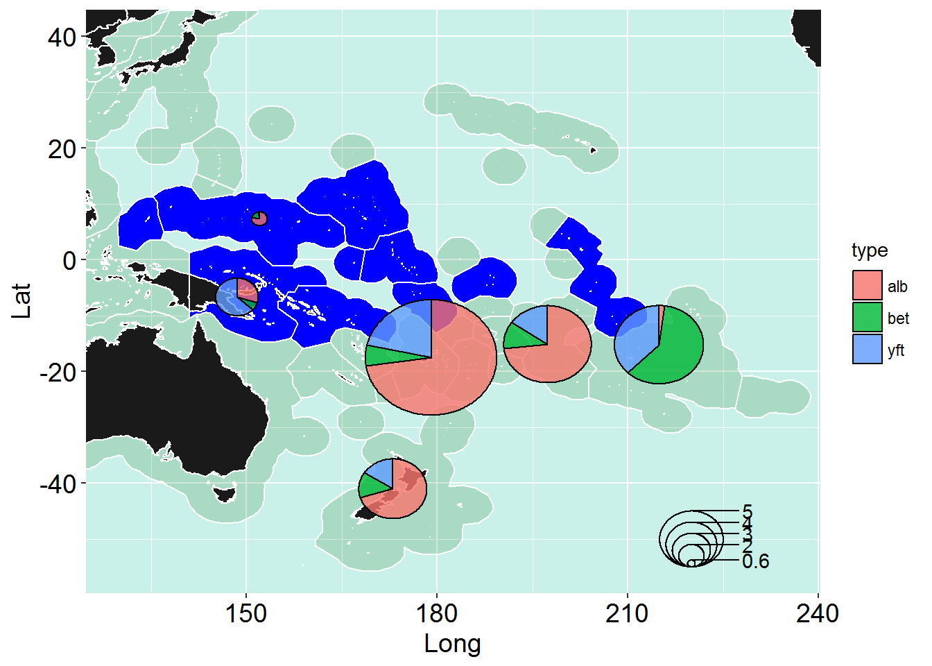
savePlot("pie_map", type="png")Changing the pie chart colours
Use the scale_fill_manual and add that in as a new layer
windows(20,16)
my_new_map + geom_scatterpie(aes(x=long, y=lat, group=region, r=tot/1500), data=pool_dat, cols=c("alb","bet","yft"),  color="black", alpha=.8) +
  scale_fill_manual(values = c("forestgreen", "red", "yellow"))+ # To manually change the colours of the piechart
  geom_scatterpie_legend(pool_dat$tot/1500, x=220, y=-50)   # this bit adds in the legend and places it at the x and y cordinates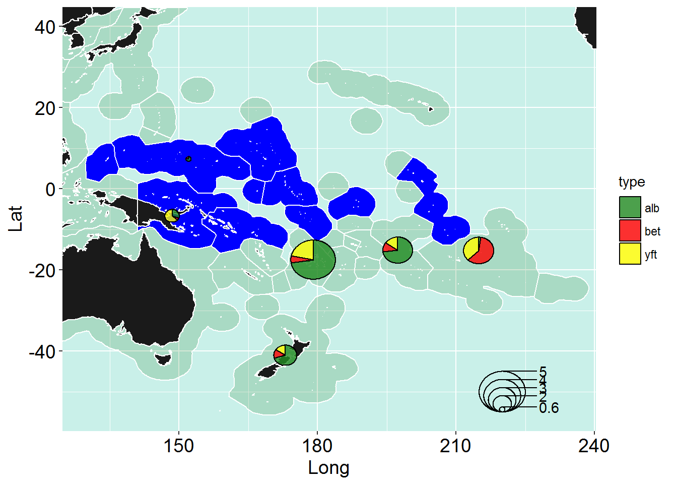
savePlot("pie_map_cols", type="png")Copyright © 2017 Pacific Community. All rights reserved.